Showing posts with label Photography Information. Show all posts

Friday, 15 April 2016

Tagged under: ,

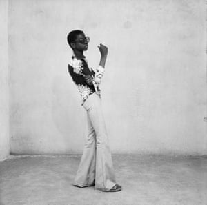
When Malick Sidibé’s Photographs Danced Before Me


Surprise-Party-Malick-Sidibe

My interest in the politics and aesthetics of photography started from an unlikely source: Dambudzo Marechera, the enfant terrible of African literature. In his seminal text The House of Hunger, a coming of age novella set in the 60s and 70s, he writes about Solomon, a township photographer who could obliterate ‘the squalor of reality’ with his photographs. His customers, who have little hope of ever leaving the township can only realize their dreams of escape through the illusions he creates:
Photographs of Africans in European wigs… Africans who pierce the focusing lens with a gaze of paranoia. The background of each photo is the same: waves breaking upon a virgin beach and a lone eagle swiveling like glass fracturing light towards the potent spaces of the universe. A cruel yearning that can only be realized in crude photography.
The residents of Marechera’s house of hunger were growing up in the era of Malick Sidibé’s early photography. At the time, they were bombarded with images from colonial media institutions. These constructions of blackness were proverbial masks that, writes Laura Taitz in Emerging Perspectives on Dambudzo Marechera “served to hamper any attempt at self-definition or self-representation.” The masks embody the contradictions of colonized identities and the politics of representation, subjects Marechera obsessively grappled with in his subsequent works, Black Sunlight and The Black Insider.
Sidibé is the antithesis of Solomon. He set out to change the idea of black beauty and fashion through his street photography and studio portraits instead of imposing or maintaining the prevailing photographic models based on Western aesthetics.
Malick-Sidibe-Christmas-Eve-1963Nuit de Noël, 1963 by Malick Sidibé
The first image of Malick Sidibé I encountered was the portrait of a young couple dancing at a Christmas party. It is one of the most iconic images from his oeuvre that spans a wide spectrum. The pose here is unrehearsed. It is graceful and dynamic and encapsulates the hallmark of Sidibé’s photography that captured the energy and hope of a generation of young ­black Africans living in a period of political and social transition.
His early photography affirms his participation in the decolonization of the 1960s, and in shaping the new look of young black and proud Africans who were consciously stylish and au courant. There is something rebellious and doggedly determined in their moves and gazes. By photographing them in the manner in which they wanted to be seen, Sidibé too was insisting on their right of being.
Looking at his photographs today, it is easy to see how productive they were in shaping the African worldview and creating a lexicon of black identity. Sidibé never stopped documenting youth culture and style in Mali. His photography journey began with youths dancing their way out of their colonial past into an era of freedom, expression and fashion.
The import of Sidibé’s contribution to the African sensibility and image is huge. His work is understated and yet sophisticated in its detail, especially the interaction of space, movement and subject. He was the first African and the first photographer to win the Golden Lion for Lifetime Achievement at the 2007 Venice Biennale that was themed, “Think with the Senses Feel with the Mind.” His place in the pantheon of photography greats is assured.

Tagged under: , , , ,

Should we let Facebook kill photography?

Forget the rule of thirds Rafi example photo
I went to a birthday party in February 2013. Two friends of mine, Jacob and Khari, were born just a week apart from one another, and they celebrated together every year. A hundred or more college students packed into their tiny apartment that winter, tossing their coats onto an erupting goose-down mountain on the couch. Theatre geeks sprawled together on low pillows singing and laughing and gossiping. The room's volume seemed to double every few minutes. My shoes, sticky with spilled beer, stuck to the floor as I squeezed through the crowd. It wasn't exactly my scene, but the birthday boys had asked me to take pictures and I wanted to leave them with a memorable image of the night.
When I carry my camera at a party or wedding or news event, my world narrows to what I can see through the viewfinder: subject, composition, and light. Those are the three building blocks photographers use to capture a moment. The crowd sang "Happy Birthday" and through all the jostling, sweaty elbows I saw these expressions of utter joy flash across Jacob and Khari's faces. I lifted and tilted the camera to surround them with their friends in the frame and—
SNAP
The shot, which sits at the top of this article, came out perfectly (if I do say so myself.) It cuts through the fuss and frenzy of the scene to tell a story about its subjects. Here's what it felt like to be Khari at this moment, in this place, at this stage of his life. Here's what it felt like to be Jacob. 
Photography is more like writing than anything else. It's not about bringing you into an environment, it's about showing you something about what it was like to live that moment in that environment. And, as a moment-driven medium, it plays a unique role in our lives that virtual reality, an environment-driven medium, can't replicate.
But that's not how Mark Zuckerberg, CEO of the company that hosts the vast majority of the world's new photographs on its servers, seems to feel. 
During his keynote at Facebook's F8 conference Monday, Zuckerberg spelled out his corporate mission: "Give everyone the power to share anything with anyone."
With appropriate zeal for a Silicon Valley techno-messianist, he presented that mission as the antidote to everything from Trumpism to the horrific violence people are living through in Syria. And he made clear that while Facebook may empower its users to share "anything," he has a specific vision of what that anything should be.
When I was a baby and I took my first steps, my parents wrote down the date in a baby book so they could share it with friends and family. When my nephews took their first steps, my sister took photos and videos on her phone so she could send them to us. And when my daughter Max takes her first steps ... I want to capture the whole scene with a 360 video so I can send it to my family and my friends and they can go into VR and feel like they're right there in the living room with us.
You or I might wonder at the logistics involved in the young billionaire keeping a stereoscopic 360-degree camera handy with an operator ready to go at a moment's notice. But it's hard to deny the futuristic appeal of recording the moment Max hauls herself up on a chair leg and ventures out across the expanse of their living room as a virtual reality scene. He can return to it again and again in his old age, laugh at the hoodie marl he preferred back then, watch his infant daughter toddle, then turn to look at the delight on his own young face.
"We're always trying to capture this purest form of an idea or an experience," he said.
If that's how he wants to remember Max's childhood, more power to him. Virtual reality is a crazy, exciting technology with implications we're only just beginning to understand.
But the way Zuckerberg talks about photography, as just a point low on the exponential graph of information richness, makes me nervous.
selfiesRafi Letzter/Tech Insider
Through his billion-plus customers, Zuckerberg may have more power over the way we create and share stories than any other single person in our species' history. But he thinks about subjective experience and memory with all the nuance of an electrical engineer.
Photographs — including selfies and awkward group photos, fulfill a specific role in our lives. If virtual reality replaces photographs it will be by erasing, not enriching the way we think about and return to our pasts. Memory will become an environment we inhabit, not a set of feelings and stories we return to. And it will be a more remote destination; you can't hang a virtual reality experience on your wall.
Some people will argue that VR's impending dominance is only a good thing, the Darwinian triumph of superior technology over the played-out. We're witnessing the beginning of this as Facebook in particular and social media in general move to emphasize fleeting experiential content like Live Video over more solid, static totems like photographs. And Facebook's purchase of the virtual reality platform Oculus tells you a great deal about how they imagine the online social future.
But I have to admit I'm not on board. I'd much prefer to live in a word where the two media live side-by-side, and where people engage with both on their own terms. 
Is such a world possible? It looks like that's up to Zuck. 
Tagged under: , ,

Malick Sidibé: the photographer who changed the idea of black beauty

The photographer, who has died aged 80, was known for his hugely influential shots of post-independence Mali
One of Malick Sidibé’s era-defining photographs. Courtesy Fifty One Fine Art Photography, Antwerp Barbican - September 2012 monthly round-up.
With his electric style, Malick Sidibé, who has died aged 80, was the Malian photographer who changed the idea of black beauty in fashion.
His most celebrated shots were the street photography that documented the jubilant fizz of post-independence in Bamako. With his 35mm camera, he captured the new urban elite: the Malians who had absorbed the stylistic cues of Jimi Hendrix, the Beatles and James Brown.
Sidibé captured the hip young things as they went from a colonial past to independence, resplendent in their leopard-print flares, finely cut berets and matching white outfits mid-dance.
When Sidibé received his Golden Lion lifetime achievement award at Venice’s Biennale in 2007, the art critic Robert Storr said: “No African artist has done more to … increase our awareness of the textures and transformations of African culture in the second half of the 20th century.”

Friday, 8 April 2016

Tagged under: ,

'Writing is intellectual, photography emotional'


HIGHLIGHTS

♦ Darlymple's photographs have received tremendous appreciation, but he described writing as his first love, saying it is an intellectual exercise where paragraphs are framed and words are carefully chosen.
For William Dalrymple, the author of books like "City of Djiins", "In Xanadu" and "White Mughals", writing is an intellectual art while photography is emotional. The author, who recently published his first book of photographs, "The Writer's Eye", says that it's a medium to express beauty.

"Photographs don't convey ideas, they express beauty. Photography is visual not intellectual. It comes from a different part of the brain," said Darlymple, whose book is a collection of black and white photographs taken during his travels around the world over the past 18 months.

Darlymple's photographs have received tremendous appreciation, but he described writing as his first love, saying it is an intellectual exercise where paragraphs are framed and words are carefully chosen.

"Writing conveys ideas, every word reflects an idea. Writing is a highly intellectual art," said Darlymple whose books have won numerous awards including the Duff Cooper Memorial Prize, the Sunday Times Young British Writer of the Year Award and the Hemingway Award.

Explaining why he took photographs from his cell phone and not with a professional camera, he said: "Photography should always be about the eye, not the equipment".

Darlymple draws inspiration from writer Bruce Chatwin (1940-1989) who emerged as a remarkable photographer after a collection of his images were published after his death.

Chatwin's photographs "were full of surprises, even to those who thought they knew him well," according to Darlymple.

"The Writer's Eye" is a compilation of black and white images Darlymple took during treks through Ladakh, visits to Yazd, Pasargardae and the deserts of western Iran, a journey along the Ganges and the marshes and causeways of coastal Northumbria and the desert fringes of Idaho.

Dalrymple said that he never planned to publish his photographs, but writer Siddharth Dhanvant Shanghvi, who lends an introduction to the book, convinced him to present the record of his travels to the people.


"I didn't plan to publish this book. Siddharth came up with the idea. It was nice to see somebody else being so enthusiastic about my work," said Dalrymple.


Darlymple's pictures redress the perception of black and white as unexciting and unemotional.


He himself challenged this perception saying: "Black and white has the power that colour can never match. I love black and white as it has an ability to surprise. Coloured photographs are everywhere."


"I always preferred black and white mainly because the medium seemed a much more daring and exciting world, full of artistic possibilities," the author said.
Source

Tuesday, 5 April 2016

Tagged under: , ,

A Guide To Being A NASA Photographer

To us here on earth we are so caught up with the magnificent photos that are being retrieved from outer space that we don’t give much thought as to who took them and how. There are some astronauts who now introduce themselves as being a photographer as well as an astronaut. A good example of this is NASA’s astronaut Don Pettit. According to Don taking these type of pictures means learning not only how to take the photos but when.NASA Photography


Space photography is not new and dates back to the 1960s. What really caught the attention of the space inspired public was the first view of earth taken from space and was dubbed the “Blue Marble” back in 1972.
These astronauts have a whole gambit of responsibilities that involves extensive training both physically and mentally, and added to this hectic roster is now perfecting their photography skills. 
The photography teaching process all began way back in 1984. The astronauts gained their photography education from a 36 page Hasselblad manual. It taught the basics but was comprised as a detailed guidebook for astronaut photography assistance. It’s purpose was to teach photography basics and to perform simple but important duties, like how to stop the camera from shaking which no doubt was one of the most important pieces of information to be relied on, and battery changes. This camera manufacturer’s guidebook was to describe the use of the Hasselblad 500 EL/M cameras which were used on the U. S. Space Shuttle.
Just as space technology has come a long way since the 1980s so has photography.
The current outer space photography consists of the ISS and spacecraft being equipped with only the very best of equipment. It is no problem for the astronauts to livestream and produce high definition videos. It also means that this new breed of photography astronauts need to learn to speak the photography language. This means learning terminology like “shutter speed” and “atmospheric air glow images”, just as an example. This is on top of the requirement for there already having to be able to speak Russian which is mandatory for the astronauts.

Tips on how to be a NASA photographer

These are just a few highlight of space photography…
  • Flash modification is required for the space vacuum setting
  • Steadying of the camera for motion blur prevention
  • Managing the astronaut attire while taking the images
  • Setting the camera rate to be compatible with the orbital motion
Some astronauts are more enthusiastic than others with their photo taking. Jeff Williams compiled about 100,000 images during a six month stint in the orbiting lab in 2006. For Twitter users no doubt they have enjoyed the earth photography provided by Scott Kelly (retired NASA astronaut).
While space photography is beautiful to look at it also provides feedback that helps to enhance astronaut safety.

Monday, 22 February 2016

Tagged under: , ,

Learn and Master aerial photography: 5 drone choices for all levels

Forget selfies. Aerial photography and cinematography is now amazingly accessible. Here are the tools you need to get stunning shots.


Done right, UAV photography and videography can be enchanting, jarring our perspective and opening the world up in new scales and dimensions. The barrier to entry is incredibly low, but with so many choices it's difficult to know what to buy for your needs.
We asked aerial shooting specialist Philip Lima to weigh in with his choices. Here they are below, along with some suggestions of our own.
And if you want to shoot like a pro, check out Lima's tips for excellent aerial photography and videography:

The entry level shooter

You're new to drones or new to photography. Either way you want to get in the air and take some great looking photos or video in a portable, easy-to-use package.


dji-phantom-3-professional-advanced-5.jpg

Philip recommends the DJI Phantom 3 series.
"I have the Pro version, because I've had everything, and I still use it. I've taken it mountain biking and the footage I get is absolutely beautiful. It doesn't do what the highest end systems can, but it's pretty amazing."
The Pro version is pricier at $1000, but the Phantom 3 Standard will set you back just under$500, and you get a lot of intelligence and a nice camera package for the price.
It's particularly suited to beginners. Built-in GPS records the Phantom's takeoff point and remembers it as you fly. If the control signal is ever lost, the Phantom returns home instantly, adding a layer of security and a workaround to the dreaded flyaway.


The Phantom 3 is fabulously stable and can fly for 25 minutes on a single charge.
The built in camera is more than respectable, shooting 2.7K video at 30 frames per second and a maximum of 40 Mbps. Or record in full 1080p HD at a variety of frame rates.
For still shooting, the Phantom 3 shoots 12 megapixel JPEG files or DNG RAW with a 1/2.3" sensor, a 20mm equivalent f/2.8 prime lens, and a preset focus optimized for aerial images. That means you pay attention to shot setup and not worry so much about your depth of field.

The intermediate shooter


img3337.jpg
Philip Lima

It's DJI's world, we just fly in it. If you want some truly professional photos or video without going (totally) broke, the Philip recommends flying the DJI Inspire with the X5 camerapayload.
The X5 series of cameras has brought all the power of the mirrorless revolution in digital photography to drones. It uses a micro 4/3 system, which was originally developed by Olympus and Panasonic and for which there are SO many amazing lenses.
The stats for the entry level X5, which is going for $1699 without a kit lens, are impressive:
  • 4K video at up to 30fps
  • Record at 4096×2160 (24fps) or1920x1080 (60fps)
  • 16MP photographs
  • 12.8 stops of dynamic range
The X5R is a step up in performance, but also cost at $3199.
  • Lossless cinema 4K RAW video
  • Record at 4096x2160 (24fps) or 1920x1080 (60fps)
  • Average 1.7 Gbps bitrate (2.4Gbps maximum)
  • Removable 512GB SSD
  • 16MP photographs
  • 12.8 stops of dynamic range
Of course you'll need a drone to fly it. Philip is a fan of DJI's Inspire series, which will give that sweet X5 payload an easy lift. You can find an Inspire Pro and X5 package for $5049.

Hollywood, baby

What does Philip Lima shoot with? Not surprisingly, the two systems already mentioned are in his tool bag and get used all the time. But to squeeze everything he's got out of a shoot, he uses two top-of-the-line systems.
The first is the CineStar-8, a heavy lift quadcopter from FreeFly, which cut its teeth making insanely steady handheld rigs for videographers.


zd-copters.jpg
Philip Lima
zd-get-close.jpg
Philip Lima

At $7,415, this is not a hobbyist UAV. You can nerd out on the specs here, but the most important thing this baby does is hoist what is without doubt the best camera for professional aerial videography: The Epic Red. Capable of 5K resolution, different Epic packages can cost north of $50,000.
For a more modest professional debut, Philip recommends the DJI S1000 octocopter flying either 5D Mark III or a GH4 from Panasonic. Both cameras are popular with budget filmmakers and professional photographers.
The DJI S1000 starts at $1900.

The hacker

Why buy when you can make? Check out our build notes for the DIY $200 drone.


pi0-kit.jpg
Source :http://www.zdnet.com/
Tagged under: ,

Photos of ‘Firefall’, When a Yosemite Waterfall Looks Like Lava

firefall
For a short time every February, when conditions are just right, Horsetail Falls in Yosemite gets transformed by a phenomenon known as “firefall.” When the sunlight hits the water just right, the waterfall looks like molten lava flowing down the side of El Capitan.
Photographer Sangeeta Dey was there to see and capture the firefall this year, and her above photo has been going viral.

“Every year for two weeks in February, the sun sets at a certain angle and illuminates the waterfall in luminescent orange and red, making it look like a fluid fire,” writes Dey, who also shares her work through Instagram and 500px. “I’ve met photographers who said that they have been coming for 11 years only to see this happen 2 or 3 times.”
“When the fall started glowing, I couldn’t believe what I was seeing,” she says. “For 10 minutes, all of us sat there mesmerized by this spectacle. When it ended, a few of us had tears in our eyes. Some people were clapping. And others were just ecstatic to finally get a chance to see it after trying for years.”
The US Department of the Interior shared about the phenomenon today as well through Instagram:

Do a search for #firefall on Instagram, and you’ll find many other people sharing their snaps of the beautiful sight:


Interestingly enough — and this is unrelated to photography — there was actually a different event called the Yosemite Firefall that started back in 1872 and continued for nearly a century. For that “firefall,” people spilled burning hot embers from Glacier Point in Yosemite onto the valley floor 3,000 feet below, creating what appeared to be a glowing waterfall when viewed from a distance.

Update: We originally stated that the historical “firefall” involved spilling embers into a waterfall in Yosemite. It was actually spilled off a cliff, and there was no actual waterfall involved. Thanks for pointing that out, Eric!

Image credits: Header photo by Sangeeta Dey and used with permission

Sunday, 21 February 2016

Tagged under: ,

10 Myths About the Rule of Thirds - Best Post for photographer

10myths
My name is Tavis Leaf Glover, and I’m an artist just like you, trying to create art that I can be proud of and share with the world. Though, something really hindered me in the beginning… the Rule of Thirds.
I want to shed some light on the Rule of Thirds Myths we’ve all been forcefully spoon fed during our creative infancy, which continues to linger as our compositions mature.

Perhaps we can change the future of art together if we help other artists abandon the rule of thirds and introduce them to the invaluable design techniques demonstrated throughout this article. I need your help because I can’t do it alone!
Like many other artists, I was brainwashed into thinking that the rule of thirds is an acceptable method of composing an image. I guess that depends on the standard of art you’d like to produce. Art at the Master Level, like Da Vinci, Bouguereau, Degas, Rubens, or art like a Sunday painter whose goal is to hang their painting in the local antique store… not the prestigious gallery or museum.
Paintings by Da Vinci, Bouguereau, Degas, Rubens
Without composition, art cannot flourish. And when using the rule of thirds to guide your composition, you’ll end up in a dark alley waiting to be maliciously fondled by mediocre art. This might sound harsh, but… well, it kinda is.
It’s my experience that people don’t like rules, and they certainly don’t like to follow them. They are always saying the same cliché phrase “well, rule’s were meant to be broken” or “I think it’s good to learn the rules, but then know when to break them.”
The word “rule” has a meaning that can be looked upon as negative. What I’m striving to demonstrate isn’t a rule that needs to be broken. It’s a canon of knowledge that you can choose to incorporate into your art if you wish. Your choice, simple as that.

MYTH #1: “It makes it visually pleasing”

To debunk this, we have to know what makes an image visually pleasing, and I assure you, it’s not plotting your subject on a rule of thirds crosshair. To be visually pleasing is to apply your composition techniques in a way which is clearly read by the viewer… without getting caught up on distracting elements or creating confusion by lack of hierarchy. How do we do that?
Well, we need to understand how the mind perceives visual stimuli. For this we useGestalt psychology techniques like Figure-Ground Relationship (FGR) to clearly separate the subject from the background.
Photograph by Henri Cartier-Bresson showing excellent FGR.
Or we can use the Law of Continuity, which will allow us to create a sweeping arabesque by using multiple objects.
Painting by Edgar Degas showing an Arabesque.
We can even use the Greatest Area of Contrast to help direct our viewer’s eyes towards the main subject.
Photograph by David Bellemere.

MYTH #2: “Pros use it”

The next myth we have is “pros use it.” Annie Leibovitz is definitely a pro, and one of the most inspirational photographers of today. So let’s grab one of her photos and simply line it up to the rule of thirds grid, then we’ll see if she used it or not.
Photograph by Annie Leibovitz.
Showing the Rule of Thirds Grid lines up to the Mantel.
We can see how the mantel lines up perfectly to the rule of thirds grid. Hmmm, I guess she did use it… but wait, how did she pose the models? How did she create such a great composition when there are only horizontals and verticals to guide us? What do I do next? I have some of the models on the rule of thirds, but where do I go now? How do I position their arms, legs, dress, and gaze? This is where we introduce dynamic symmetry.
This is a Root 4 Rectangle with its Basic Armature (two diagonals, four reciprocals, horizontals and verticals).
A Root 4 rectangle can be divided into four smaller Root 4 rectangles.
In order for Annie to properly pose the models, she uses dynamic symmetry. That’s basically a fancy term for grid system.
This is a 1.5 rectangle with it’s Basic Armature (same size as many camera sensors) and 3 can fit inside a Root 4 rectangle.
This is the complete grid system.
To put it simply, a grid system is something we can use in our photography to help us organize our composition. We can use the diagonals, verticals, and horizontals to help us create rhythm and unity throughout the image… whether it’s a painting, photo, or sculpture… dynamic symmetry can be used for all of them.
“Laocoon & His Sons” is a Greek sculpture that was constructed by using Dynamic Symmetry.
We could get really involved into explaining this system more, but let’s not lose focus of the main purpose, which is to expose the rule of thirds for what it is… a watered down rule that has brain washed us all into thinking it’s worth sharing with the world.

MYTH #3: “It moves the eye around the image.”

This couldn’t be further from the truth. Plotting your subject on a point without consideration for the whole will not help create movement within your composition.
Photograph by Tavis Leaf Glover
When we learn of another Gestalt psychology technique called the Law of Continuity, we’ll discover several tools we can use to create movement and unity, which will move the eye around the image. The most visually pleasing one is an Arabesque.
Photograph by Tavis Leaf Glover
This is a curvilinear element you can incorporate into your art to create a beautiful sweeping movement throughout the image. Master painters used these extensively throughout their work.
Painting by Vincent van Gogh showing an Arabesque.
Another technique used to create movement is called a Coincidence. This is defined as edge-to-edge relationships, which unify multiple elements and can create movement side to side and up and down.
It’s not a solid line as you might think when you hear the term “leading lines.” It’s broken, hidden, and a magic trick which we can use to allow the mind to easily close the gaps.
Painting by Caravaggio shows how he hides his lines by understanding the Law of Continuity.
In this photo we can see the edge-to-edge relationships Annie Leibovitz creates by using the limbs of the models.
Photograph by Annie Leibovitz showing Coincidences.
We can also see it in this painting of the Mona Lisa by Da Vinci, and in this complex composition by Bouguereau.
Paintings by Da Vinci and Bouguereau showing Coincidences.

MYTH #4: “It gets the subject out of the center.”

First off, who decreed that the center of a frame is so bad? Why are we lead to believe this?
Photograph by Tavis Leaf Glover
There’s a Gestalt psychology technique called the Law of Symmetry, which basically means the human mind is always trying to find balance in visual stimuli. So if we use the rule of thirds and place the subject off center, then we will need a counterpart to help us balance the image. If there’s no counterpart, then we’ve just created horrible balance within our composition.
Photograph by Tavis Leaf Glover
There is vertical balance (which I call breathing room), and there is horizontal balance (which I call gazing direction), and we must understand how to control each of these in order to create a properly balanced composition.
Painting by Bouguereau showing proper balance from top to bottom.
Painting by Degas showing proper balance from left to right.
Here’s a photo I created which has the main subject centered, but is properly balanced because vertical and horizontal balance was considered.
Photograph by Tavis Leaf Glover showing how Balance can be properly achieved from top to bottom and left to right.
It took me years to erase the damage the rule of thirds caused on my compositions. I was always placing the subject on one side or the other without consideration for the image as a whole.
Photograph by Tavis Leaf Glover before learning design and Gestalt psychology techniques.

MYTH #5: “Basis for a well balanced and interesting shot”

We already covered the Law of Symmetry, which covers the proper balance of an image, but what we didn’t mention how the rule of thirds gives birth to unwanted negative space. If we are generically placing our subject into one of the crosshairs without consideration of the whole, then we won’t have a counterpart on the other side of the composition and we’ll have negative space that takes attention away from our subject.
Photograph showing how the rule of thirds creates unwanted negative space.
.
Negative space can be properly used to create a feeling of isolation or loneliness, but to use it without sophistication is a rookie move.
Photograph by Gregory Crewdson using Negative Space to enhance his story.

MYTH #6: “It’s a great starting point for beginners”

In my own experience, the rule of thirds only lead me down a dead end road. I thought of it as revolutionary at first and I was boasting its powers to photographers who were just starting out.
image34
Later I found myself at a plateau and not able to understand how to properly compose an image because the rule of thirds was guiding me.
image35
Dynamic Symmetry Grids are just as easy to use as R.O.T.
If new artists start with the grid of dynamic symmetry instead of the rule of thirds, they’ll be able to later take advantage of the diagonals, which they can create rhythm with… by posing the model, or applying paint strokes. The available diagonals within the rectangle will limit the number of directions you use, called a gamut, which will create a more powerful composition…rather than the spokes of a bicycle tire.
Painting by Bouguereau showing how he creates rhythm in the model’s pose based off of his grid system.

MYTH #7: “Artists from the Renaissance, or Greek artists, created the rule of thirds”

The rule of thirds was first documented in a book by Smith (around 1797), and if you take a look at his painting, you’ll see that he wasn’t a master at all.
image38
Da Vinci would be rolling in his grave if he heard anyone say he was using the this. The amount of schooling, studying, and practice he put into his compositions, and someone is going to water it down to something as simple as the rule of thirds? No way!
Da Vinci, along with other master artists, Greek included, used dynamic symmetry, the golden section, and other design techniques like arabesques, gamut, coincidences, radiating lines, figure-ground relationship, ellipses and enclosures.
Painting by Bouguereau showing different design techniques.

MYTH #8: “The human eye naturally gravitates to the intersection points”

Photograph of a generically placed tree and horizon line.
I truly wish composition were this easy. Place your subject in a crosshair, and BAM, you’re automatically controlling the viewer’s eyes. Not so fast! What about the fact that we are drawn to areas of high contrast?
When we make our subject the Greatest Area of Contrast (GAC), won’t we look there first…no matter what position they are in?
Photograph by Tavis Leaf Glover showing the Greatest Area of Contrast and a Counterpart.
Another thing that pulls our eyes is something I call Edge Flicker. It refers to high contrasting elements near the edge, which greatly distract the viewer from your subject.
Creating a hierarchy of contrast and keeping the edges free of distractions will help you control the way your viewer’s eyes move around the composition.
Painting by Whistler showing no Edge Flicker when Adjusted.

MYTH #9: “Cropping to the rule of thirds after shooting a photo is a great way to save an image”

Cropping a poorly composed, badly lit image will not save anything. That’s starting at the end and working backwards.
Try not to crop. Get it right in-camera to save precious pixels.
Learn composition and Gestalt psychology techniques so you know what to look for, how to solve visual problems, and get it right in camera. Don’t sacrifice precious pixels for the rule of thirds. Your creativity deserves better.

MYTH #10: “The power points, or golden points, create tension”

Placing your subject on a third is not going to create tension as we’ve learned so far.
Photograph by Tavis Leaf Glover showing how cropping doesn’t create tension.
If we take a look at a Gestalt psychology technique called the Law of Proximity, we’ll see how visual tension can be created. Like this painting on the ceiling of the Sistine Chapel…they are clearly unified by their proximity, but another thing to notice as we view this is visual tension created by the fact that they are almost touching, but not quite. It’s the moment before impact.
Painting by Michelangelo
Or this photo where the man is almost within reach of his dying wife. It’s that close proximity that creates the tension.
Photography by Tavis Leaf Glover
When considering the Law of Proximity, distance can create negative space, which in this photo creates a tension in the room.
Photograph by Gregory Crewdson using negative space to create tension.

Conclusion

So many tricks and techniques can be applied to create a remarkable composition, which communicates clearly to your viewer. Abandon the rule of thirds. Leave it behind and adopt the dynamic symmetry grid which is just as simple to use, but can leave many more options open for you as your art progresses.
Painting by Toulouse Lautrec.
If you found this information useful, please share it with your friends. Help me tackle this rule of thirds beast, kill it, and introduce better techniques to others who are in need of powerful composition. Learning powerful composition is the only path to becoming a master of your craft.

About the author: Tavis Leaf Glover is a fine art photographer and author based in Honolulu, Hawaii. You can find more of his work on his website and on Flickr. Glover is also an educator about applying Gestalt psychology principles to photography and art.